
The Secret Capital of EGS:
3. Visual guidance on a disjointed cityscape
location: karhu concept store window, lasipalatsi, mannerheimintie 22–24
The face of the city is full of letters, most produced by machines and commercial in nature. But some are still written by hand.
We have now reached the corners where the capital’s best-known neon lights shine bright. Lasipalatsi is known for its flashing lights, and while exploring the city you will see all kinds of texts, names and messages, the majority of which involved money changing hands and more often than not are written by machines.
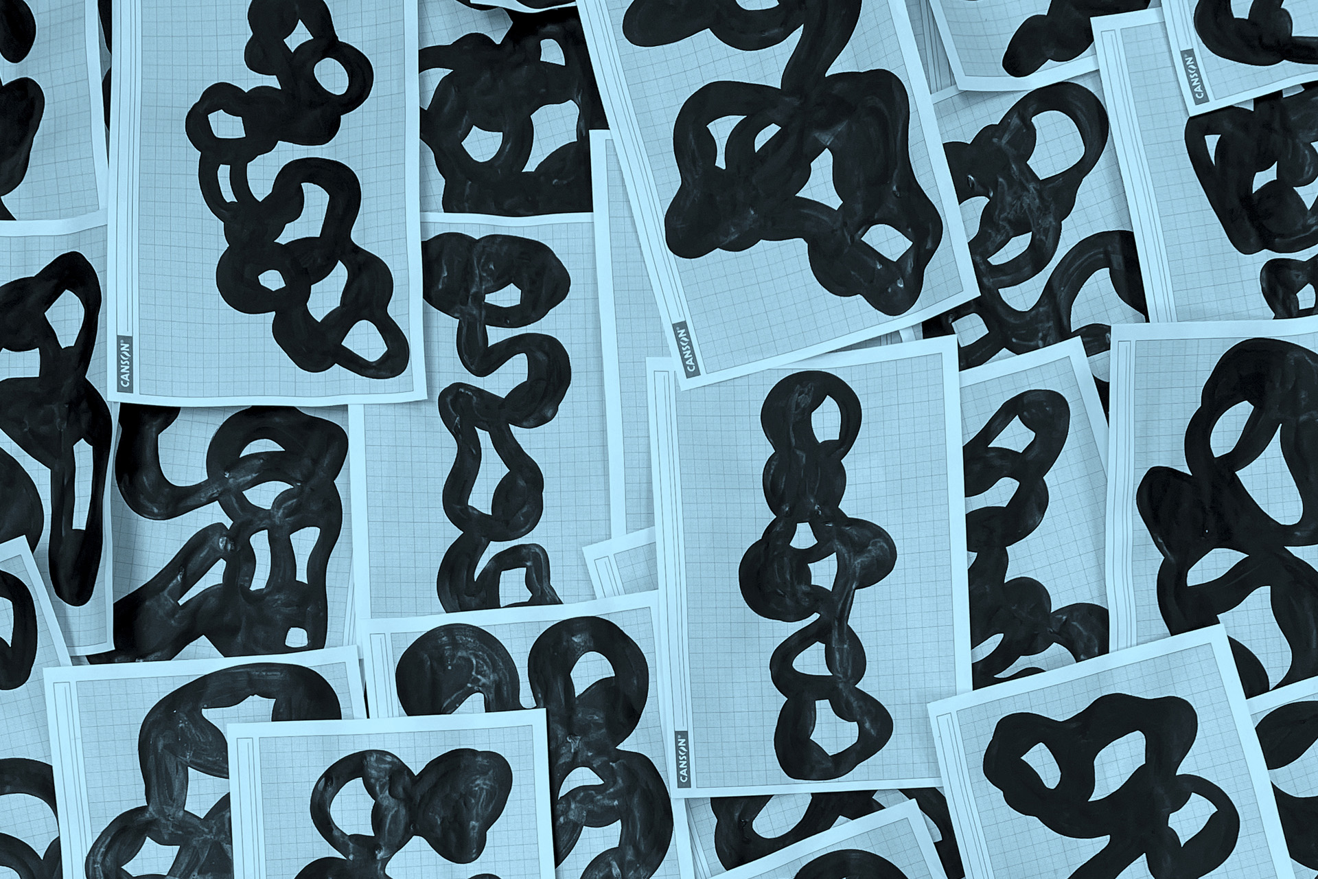
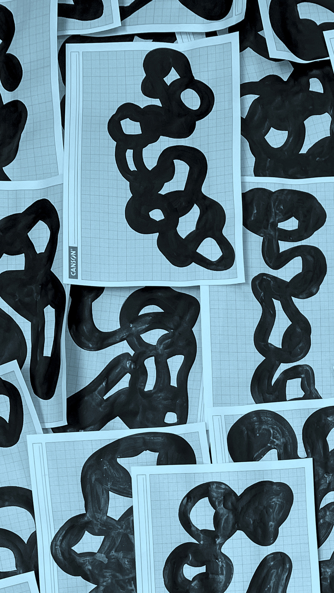
Here and there in the capital, however, you can still spot hand-written texts and initials. They are uneven, sometimes the letters have dripped slightly, and they are not always clear. They are greetings from the Republic of EGS. One of these glows bright for a moment in a display window: the three letters EGS.
This is simultaneously an image, a text and a name, because in the Republic of EGS, residents choose their own names, and they are generally like this – just a few letters long. They are aliases, artist names and honorific titles, in no language yet all languages at the same time. A name lets an artist take on a new nationality with no attached country or gender. It is custom that the name is drawn as part of the city.
In the Republic of EGS, residents choose their own names.
In the ordinary world, greetings from the Republic of EGS have also been treated with hostility. Over the period 1998–2008, Helsinki’s decision-makers, police and guards pursued young artists in the name of zero tolerance, to stop them scribbling everywhere, was the excuse. The aim was to protect the city’s public face and texts.
Adverts and signs were permitted, graffiti, stickers and posters were not. Allies and ambassadors of the Republic of EGS retaliated and eventually the artists won.
Nowadays, you can still see the stratification to some extent in Helsinki. Some architecture from different eras remains, and while the letters are found mostly in advertisements, they can also be found on electrical cabinets and lampposts.
In the Republic of EGS, there are not really any advertisements, or, if there are, they invite people to shared celebrations. Here, there are more of the people’s own texts, as in the Republic of EGS everyone has the right to write their own name on the city.
The Republic’s silly cityscape
In ordinary Helsinki, like in all large cities, there has been a long-standing desire to manage and control what we see, feel and hear in our shared space. Behind this lies a need to harmonise, standardise and sterilise. At the same time, those who hold the power have sought to limit who shapes the face of the city and writes its words.
In the 1960s and 1970s, this need for control unravelled into a rage-filled fit of destruction. Neoclassical buildings, wooden houses and Jugend palaces were torn down by the dozen. The aim was to weed out stratification – the historical layers and wrinkles that make a city alive.
Idealisation of discipline in the cityscape reached its peak in the 1970s with strict instructions for facades and dialogue on environmental aesthetics. Anything decorative or innovative was labelled visual pollution. It was even argued that colourful neon lights would be a source of stress for city residents. The solution offered was the plain typography of the typeface Akzidenz Grotesk, and there was also a suggestion that colours be restricted to white and blue. If this vision had been realised, Helsinki would look like an old-fashioned phonebook, informative and functional, but disgustingly boring.
In the Republic of EGS, a free and humorous approach is taken to the capital’s cityscape. A city needs irregularity, surprises, flaws and mistakes, beautiful and ugly things side by side. Decorative elements, fun, and impracticality are all welcome. The city is neither results-driven nor a regulated system. A dysfunctional city can be functional, full of colours and words that do not quite fit in their boxes.
Continue your journey towards the square surrounding the Three Smiths Statue. Along the way, keep an eye out for posters for gigs, stickers, and greetings from the Republic of EGS.
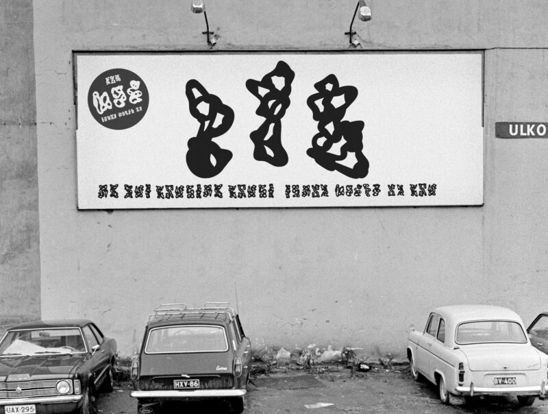
Outdoor communication in the capital of the Republic of EGS in the 1970s.